Sunday, April 26, 2009

Color Schemes

Complementary

Analogous

Triad

Wednesday, April 1, 2009

Wednesday, March 18, 2009

Light series 2: Adam and Eve's Retail Store


Adam and Eve's is a fun, local lingerie and novelty shop that serves as a very interesting study for how various lights effect the style, feel, and operation of a space.
When one first enters the store, they are greeted by a central display that is places beneath a chandelier. This chandelier is the only lamp of its kind within the space and serves as an effective method of making the mannequin the major focal point as well as give the space a sense of "sensuality". Surrounding the grand mannequin is a variety of other eye catchers. Many of which are accented by focal track luminaries. These directional luminaries are specific to special displays and also highlight new merchandise.
Track lighting and florescent lights are utilized throughout the store to emit both ambient and focal luminance while store front windows also receive a flood of daylight. Track luminaries also help with organization of the space by attracting visual order both on wall displays as well as floor displays.
There is also a interesting use of neon light in signs and ultraviolet light highlighting displays. The owner of the store,Lisa, informed me that the neon lights were great visual simulators that were used to give a "exciting and gawtty" feel to the customers. She stated that we often associate neon lights with exotic club signage and night club attractions, and due to the nature of the store... this method served appropriately.
One of the most prevalent issues involving the store lighting was the control of heat emission from the combination of daylight , fluorescents, and track lighting. Lisa explained that often in the summer and spring months, there is a great deal of daylight that shines in from the front facade of the store. The heat from the sun becomes even more intense when accompanies by the heat that emits all day from the powerful track lighting and large fluorescents. She complained about the energy it takes to cool the store and the high absorption of heat by the window displays. Glare only tended to occur when reflecting off of plastic mannequins and mirrors. Although the mannequins weren't obviously distracting, light reflected from track lights often discomforted the eye.
Possible solutions include building shade over the front facade to shed away some direct sunlight. There is the option of introducing darker hues to the space to help with the absorption of extra light and heat and the decreased use of fluorescents during the seasons where daylight is prevalent. To reduce Glare from mirrors, I would suggest simply using recessed lighting of placing directional lights away from the view of the mirror to avoid direct shinning into the customers' eyes.


Wednesday, March 4, 2009

Light series 1: Daylight study

5:00pm/january31
5:02pm / Valentine's Day!


5:04 pm/ February 28


5:00pm/ March 14 Snow Day!

5:01 pm/ April 11


5:02 pm/ April 25


Saturday, February 14, 2009

Light Series 2:The Continental Resturant, Atlantic City NJ


The picture above are of The Continental , one of the many luxurious restaurants located within the Pier at Caesar's Casino; Atlantic City, New Jersey. I visited this restaurant over the summer with a couple of friends and loved the spirit that interiors presented. The restaurant serves a variety of entrees from around the world and also translated its eclectic character through the variety of interior concepts and lighting.


Luminaries included within the space included ambient lights placed behind mirror fixtures, flood lighting hidden behind top wall fixture, magenta LED lamps within the lounge area, and candlelight glows presented along tables. The majority of lights were dimmed to provide a glow instead of alerting light to make customers more relaxed and calm. Natural materials used in interior construction (stone columns, wood floors, dark granite counters) often helped to absorb light and add to the effect of providing an organic and intimate setting. The LED lamps in the lounge gave the space a eclectic club feel. The large central lamp fixture had a very dull glow allowing its white and magenta tips to service as the visual stimulator. Placed in the restrooms were dimmed clusters of bulbs fixed within the confines of mirrors and clear sink fixtures. I can say that was one of the first times I HAD to take a picture in a restroom:-)


Glare and brightness were not an issue due to the dimmed illumination and a low use of reflective materials within the space. The only improvement to suggest would be to offer a little more lighting in the stalls so that customers can feel a higher sense of sanitation from being able to adequately see the space around them. The restaurants lighting plan was designed very well and catered well to the needs and theme of the setting.


Tuesday, February 10, 2009

Critique Space Evaluations
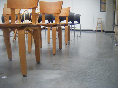


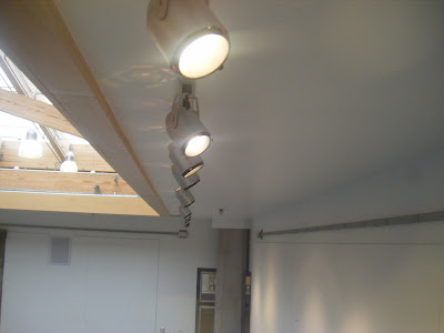
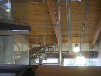
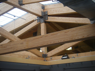
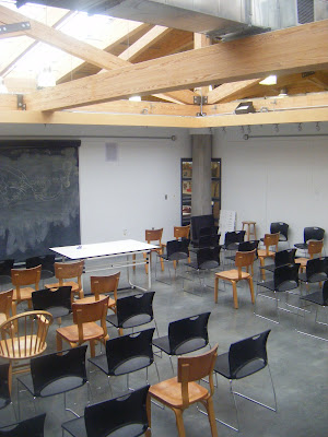
The critique room sits atop the center of the 4th floor of the Gatewood Studio Arts building and is primarily used as a multi-use space for Interior Architecture classes, meetings, presentations, project evaluations, etc. The critique room’s appearance, layout, and size are directly related to the various functions that takes place in the room. The room is adorned with white tack board walls, track lighting that is situated along the perimeter of the room. Window slits appear along the four quadrants of the room which peer out to studio desks surrounding the space. An open ceiling plane gives the critique space its distinctive and serene quality. Natural light floods the space through translucent windows on the roof allowing for general lighting during the day. Although the natural light does allow for a more invigorating atmosphere, the variations of light quality during different times of day often causes distractions during class and sometimes affect values of shade used during drawing projects. The dark polished concrete floors of the room help to contain the light and prevent glaring in the space. The overall impression of the critique space is that its openness allows for creative thought and collaborations between students and teachers; its large scale provides opportunity to carry out many activities (making it very useful); and its natural light quality, although sometimes distracting, creates a motivating atmosphere.